Building Accessibility Into the System
How Design Systems Make Inclusion the Default
Why accessibility shouldn’t start at the finish line
In most digital teams, accessibility is seen as something to be tested once the product is built, not something that shapes it from the start. When treated as a final checkpoint the typography is already fixed, the colours are chosen and the code structure is set. Any accessibility “fix” becomes a time-consuming retrofit.
At Inclusive Design Lab we help organisations avoid that trap by building accessibility into their design systems - the reusable foundations that power every button, header, and component across their products. When accessibility becomes part of the system itself, it stops being a compliance task and starts being an enabler of speed, quality, and consistency.
A practical experiment: from Material UI to Carbon
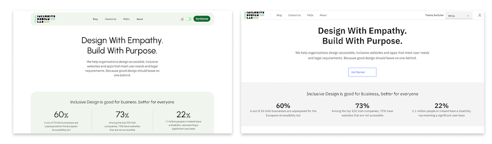
To test this idea in practice, I rebuilt the Inclusive Design Lab homepage using IBM’s Carbon Design System, migrating from Google’s Material Design 3 and Material UI React library.
The goal was simple: to see whether Carbon could deliver accessibility by default and without the manual tweaking and post-development testing that accessibility work often requires.
In my experience, Material Design is an excellent library (flexible, mature and widely adopted) but achieving full WCAG compliance often requires developer input such as adjusting contrast ratios, fine-tuning focus states and managing ARIA attributes. I wanted to find out if Carbon, with its “accessibility-first” philosophy, could do more of that heavy lifting automatically.
Designing in Figma: accessibility through constraint
I began in Figma, using Carbon's official design kit to recreate the Inclusive Design Lab homepage. Carbon's grid and token structure felt more rigid than Material's, but that rigidity was a good thing. It enforced spacing, typography and colour consistency that directly supported accessibility goals.
- Colour tokens maintained contrast across light and dark themes.
- Component rules ensured predictable layouts.
- Focus states were visually clear and consistent.
- Interaction patterns followed accessibility best practices.
It became clear that Carbon's limitations didn't limit creativity but instead created a safety net for inclusive design.
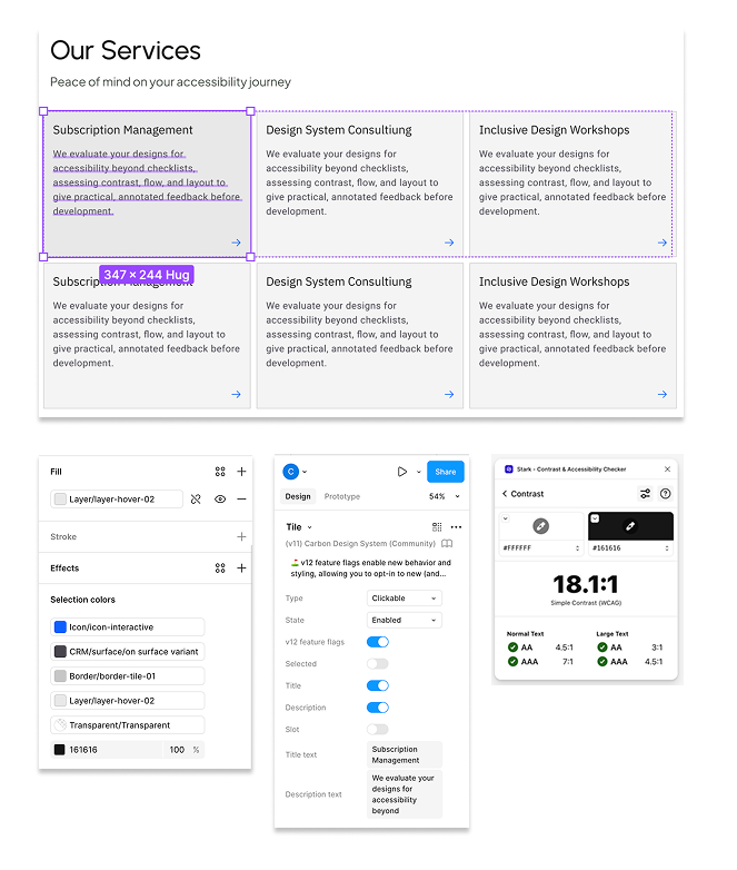
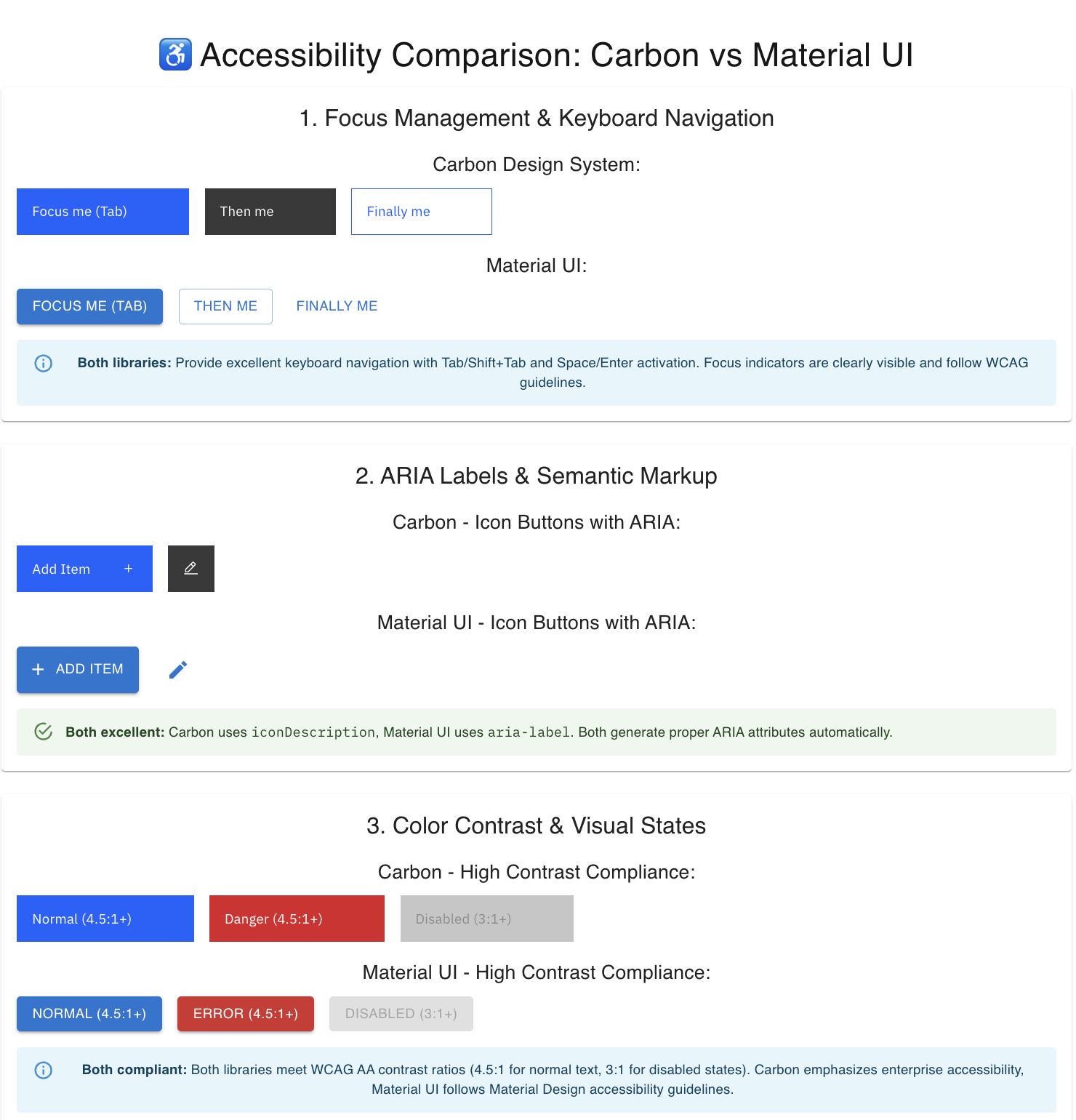
Testing accessibility at code level: button component test
Before moving to a full rebuild, I ran a focused button accessibility test comparing Material and Carbon components at code level.
Each was tested for keyboard navigation, ARIA semantics, colour contrast, screen-reader behaviour and motion sensitivity. Both performed well but Carbon had the important advantage of needing fewer steps to reach full compliance.
Carbon’s buttons respected reduced-motion settings, had higher default contrast and came with clearer documentation on supported interactions. Material, while elegant and flexible, needed small configuration tweaks to reach the same standard.
While this might sound minor, in a product environment those small differences scale. Multiply that by hundreds of components and you can see how a design system with accessibility built-in reduces friction across design and development teams.
Building in React: testing Carbon's real-world readiness
Next, I rebuilt the site using Carbon React components inside a Next.js framework. I initially experimented with automated "design-to-code" tools like MCP and Copilot, but as with similar tools (Figma-to-Code, Anima), the output lacked semantic awareness. Components rendered as generic <div>s without proper roles or ARIA attributes which confirmed to me that AI and automation still need human oversight when it comes to accessibility.
By manually implementing Carbon's official React components (@carbon/react), I achieved a lean, semantic and fully accessible codebase. Carbon's documentation made it straightforward to wire up navigation, accordions and theming tokens while maintaining accessibility out-of-the-box.
Accessibility highlights included:
- Proper heading hierarchy and landmarks (<section>, <nav>, <footer>)
- Clear ARIA labelling on navigation and actions
- Theme tokens maintaining WCAG AA contrast
- Keyboard focus visible and intuitive
- Screen-reader testing with VoiceOver confirming correct announcements
The end result was a fully compliant and highly usable and inclusive homepage with only minor enhancements needed, such as richer labels for CTAs and live-region announcements for dynamic content.
What the experiment proved
Migrating to Carbon confirmed my assumptions that when accessibility is built into the design system, it naturally flows through to every product built with it.
The project demonstrated several key advantages of accessibility-first design systems:
- Reduced design-development misalignment – shared tokens and components ensure that what’s designed in Figma is what ships in code.
- Scalability – accessibility improvements at component level cascade across all products.
- Efficiency – teams spend less time firefighting accessibility issues and more time improving usability and experience.
- Clarity – consistent documentation and component patterns reduce ambiguity and developer guesswork./li>
It also reinforced that “constraints” can sometimes be beneficial. By working within a consistent, accessibility-safe system, designers and developers can focus on solving user problems instead of checking contrast ratios or adjusting focus rings.
Design systems as enablers of inclusion
A well-structured design system is more than a UI toolkit but also a mechanism to successfully deliver accessibility. Every component becomes enables inclusive design decisions and every token encodes accessibility standards. The result is a product ecosystem that scales inclusion by default.
In practice, this means:
- Teams can move faster without sacrificing accessibility.
- Designers can rely on accessible defaults without needing to be specialists.
- Developers can build confidently knowing that ARIA roles, colour contrast, and motion preferences are already handled.
When accessibility is a system property, not a retrofit process, it frees up energy for what really matters - designing better experiences for everyone.
How Inclusive Design Lab supports accessible design systems
At Inclusive Design Lab, we help organisations make accessibility a built-in feature of their design systems — not an optional layer added later. Our approach bridges design and development, ensuring that every component, token, and guideline within your system supports WCAG and European Accessibility Act standards from the start.
We work with teams to audit existing design systems, introduce accessible foundations (tokens, components, and documentation), and establish scalable governance so accessibility becomes part of everyday design and engineering workflows. Whether you’re building a new system or refining an existing one, Inclusive Design Lab ensures accessibility is embedded at the core — enabling your teams to design faster, develop smarter, and deliver consistently inclusive user experiences.
Inclusion starts here
Book a free consultation to explore how Inclusive Design Lab can elevate your product and business.